
Photo by Sharon Pittaway on Unsplash
At a recent business “speed-dating” event sponsored by Warrenton Regional Chamber (of Commerce), members had the opportunity to spend ten minutes with individual professionals in the fields of law, insurance, social media, and marketing.
In my time with Liz Johnson of Mountain View Marketing, she quickly considered my company’s business card and asked me, “How did you choose your logo’s colors?” My response of, “The original marketing company I worked with several years ago had me choose my own colors,” certainly surprised her.
After a moment she said something like, “In my 38 years of experience, I have never once asked a client to choose their own colors. I have always recommended the best branding colors to them. There is tremendous meaning in color. The colors you choose convey their own message.”
This was one of those times where I sat back and thought, “Hey! I already know that.” I had just forgotten that I knew.
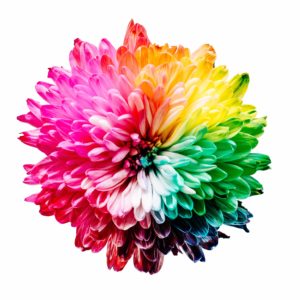
I knew that colors have meaning because when choosing the colors of my home, inside and out, I had studied Alexandra Stoddard’s Book of Color. Check out where I’ve written about that before. https://liftedup.us/the-color-box/
So while I had carefully and thoughtfully created a vibrant kitchen in a deep merlot with buttercream cabinets, calm bedrooms in soothing hues of blue, and a creative thinking/writing space in a lovely green, I ignored what I knew about colors’ meaning when it came time to design my logo.
Looking back I likely spent less than two hours choosing my “four hands” colors.
![]()
I chose them because they were cheerful and not with any consideration of the science behind the effect they would cast on my audiences, clients, and students.
Now, an earlier version of me might have been offended at what Liz said. We have a tendency to become defensive when someone questions our choices, don’t we?
But I became enthusiastically excited because I GOT what she was saying. And I was even happier when I won a free hour of consultation with her to choose new colors. We’ll be re-launching my logo in a meaningful palette before fall.
A new friend summed up this experience beautifully: “Even coaches need coaches. Just because we’re experts in one field doesn’t mean we’re experts in every field.”
In business, as in our personal lives, sometimes we have to step back and seek, then accept, then follow, helpful advice from someone who knows more than we do.
Admitting that we don’t know everything is the first step to wisdom.
Norma, actually I like your design. The hands reaching out with hearts in the palms and the fact that the colors do not represent race. Which is a volatile issue most everywhere anymore. I think that the colors that you have, represents reaching out to all people. Just my opinion.
Thank you for your insight, my friend. The logo is staying intact. Just the colors are being reworked. Did you read what Frederique wrote? It’s lovely!
I like the green going up like a tree, the brown going down towards the earth. Purple and maroon are “rich” colors, indicative of a wealth of possibilities. So I would tend to agree with Judy! 🙂
Hi Frederique. Thank you for being a first time commenter! Your interpretation of the colors gives me a warm fuzzy feeling, so thank you for that. We are keeping the logo format of the four hands reaching up, down, and outward. Only the colors will be changed. I am eagerly anticipating what the expert comes up with. She mentioned that she has a thousand page document on colors and their meanings. That’s a lot of info! Thanks again, and I see that you are signed up for the speaking class with the Chamber. Look forward to meeting and working with you!